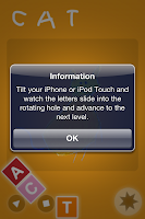
iWriteWords is a handwriting game for young children to learn the strokes of the English alphabets and numbers. For the purpose of evaluation, we have downloaded the free Lite version to assess its basic user interface.
Using Nielson's 10 usability heuristics, we present the evaluation of this app:
Visibility of system status
Feedback time is good, not much lag time between action and feedback. Intuitive touch and drag actions most of the time. However, at some stages, alphabets drop down and float around the screen, distracting the user and making the interface messy. As multi-touch is not supported, it is sometimes difficult to control the system in a way the user wants it to be. Also, there is first-time notifications of instructions on how to play the game. This is not good for small children, who, fundamentally, cannot read.
The sequencing of the numbers to guide users in writing alphabets and numbers follow normal writing conventions, which is good. Both touch and shaking actions induces feedback from the system, and motion of free-floating objects are consistent with basic physics. This creates a very real learning environment for the kids. However, we do feel that there is too much animations within the app, creating major distractions for the user and also some usability problems. The buttons rotate and shake along with the other elements in the app, and this does not correspond to the real world as buttons are normally static.
User control and freedom
Supports replaying of previously written characters/words. User can go back to main menu any time., albeit using different buttons in different stages. Settings can be changed from the "Settings" app on the iPhone/iPad. This is both good and bad, depending on the user. On one hand, this prevents young children from accidentally customising certain options and end up in a foreign environment. However, this non-trival way of customising options also limit what a child can do within the app without parental supervision. There is only a replay function for users to view what they have complete so far, but no re-do function for them to go back and retrace a certain alphabet or word.
Consistency and standards
Gameplay is generally consistent. Shake and touch actions are intuitive but we feel that the shaking actions are redundant as the focus of the game is on teaching children to write, which only requires touch actions. The "back" button is inconsistent across different screens. Some screens present a triangle symbol while others present a "no-entry" symbol, although both leads back to the homescreen. Other buttons like the replay (triangle)/ stop (square) buttons are inconsistent with standards and the user have to guess what they mean in each context. The additional effects of spinning buttons do not help in identifying their functions. Overall, this app presents an inconsistent interface which potentially present usability issues for children and even adults using the app.
Error prevention
Good audio and visual feedback when the wrong strokes are drawn. However the feedback might a be a little too fast sometimes, cutting the strokes off before the user finishes drawing. Not much room for errors to be made in terms of settings, since settings are controlled externally and not within the app. However in the information page there is a hidden "email" button that children may accidentally press and end up in a foreign (email) environment instead. Also, there should not be a "more apps" advertisement button in an app for children, for they usually like to explore every single button and would end up purchasing additional apps.
Recognition rather than recall
Recognition-based instructions for children to follow the sequence of numbers to trace a certain stroke. But, the fundamental problem here is that the child needs to be able to recall numbers and their sequences, before being able to follow them. Here, they are assumed to know numbers before playing with this app, which would then defeat the purpose of having this game in the first place.
Flexibility and efficiency of use
The games are easily quittable to return to homescreen. There is much flexibility in the modes of gameplay (easy mode on/off) and several functions within the game. However, making the changes would require parental help. There is also no option to turn off any sound effects.
Aesthetic and minimalist design
Confusing and meaningless design of falling alphabets in the gameplay - this does not present a minimalist design.
The choice of green and red as the basic colours for the app is colour-blind-unfriendly. The sequence numbers to induce users to trace the strokes are redundant, as dots would suffice as affordances to users to trace. There is also excessive animation in the entire app, presenting a confusing interface. We also think that the shaking function in the alphabet song is redundant.
Help users recognize, diagnose, and recover from errors
The notifications are not readable by kids, rendering it useless if the child is left alone to operate the app.
However, the animation of the character + sound effect when a mistake is made when drawing the strokes, is good.


No comments:
Post a Comment